

 JW
JW LI
LI DJ
DJ JR
JR MP
MP
Create Step-Free Arrival Experiences
Utpal TalatyHead IT · K. Raheja Realty P. Ltd.
To make accessibility feel like an organic part of the architecture, our architects aim to weave it in during the project's conceptualisation stage itself. They consider everyone in their plans, be they senior citizens, kids, individuals with temporary mobility issues, or wheelchair users. This helps us build inclusive spaces that allow all residents to live in comfort and with dignity.
A smart design move that improved accessibility while also strengthening the overall concept is the step-free arrival experience in one of our Mumbai properties. The entrance features a landscape design that facilitates ease of movement for seniors and wheelchair users. It seamlessly links the parking area and entry gate to the building's main lobby without any staircases or ramps. At the same time, it also looks visually cohesive and inviting.
Thanks to this approach, inclusive design doesn't feel like a separate add-on for accessibility compliance, but becomes architecture that appeals to everyone.
Use Layered Low-Glare Lighting
Jake WoodsLighting Consultant · Residence Supply
The best accessibility decisions happen early enough to shape the design rather than being added after the fact. As a lighting and interior designer, I approach inclusive use as part of the full experience of a space: how clearly people can find an entrance, move through rooms, understand where to go, use controls, and feel comfortable regardless of age, mobility, or visual ability.
One design move that has improved access for a wide range of users while also strengthening the overall concept is layered, low-glare lighting that makes circulation easy to understand.
Rather than using one bright overhead fixture, I create a hierarchy of light. Soft ambient lighting establishes the space, while targeted, well-shielded lighting helps identify hallways, entry points, steps, transitions between rooms, and functional surfaces. This supports people with reduced vision, older adults, guests carrying bags, and anyone navigating an unfamiliar home at night. At the same time, it makes the interior feel more deliberate because light draws attention to the architecture rather than overwhelming it.
For example, lighting the vertical wall plane in a hallway and adding subtle illumination near changes in level can make the route feel intuitive without resorting to signage or institutional-looking fixtures. People do not necessarily notice the accessibility feature itself; they simply find the space easier to use.
Glare control is especially important. An exposed bulb or sharply focused downlight can create dramatic contrast, but it may also leave surrounding areas too dark and make it harder to judge depth, steps, or edges. Diffused fixtures, consistent lighting levels, and thoughtful fixture placement create a safer, calmer environment while still supporting the material palette and mood of the space.
The broader lesson is that inclusive design often produces better design for everyone. When circulation is clear, furniture layouts allow comfortable movement, lighting supports visibility, and controls are placed where people can reach them naturally, a space feels more welcoming and more resolved.
Accessibility does not need to announce itself. When it is integrated well, it reads as thoughtful architecture: functional, comfortable, and naturally easy to use.
Clarify Pathways With Wider Doors
Laura IntscherArchitect · Secret Base Design
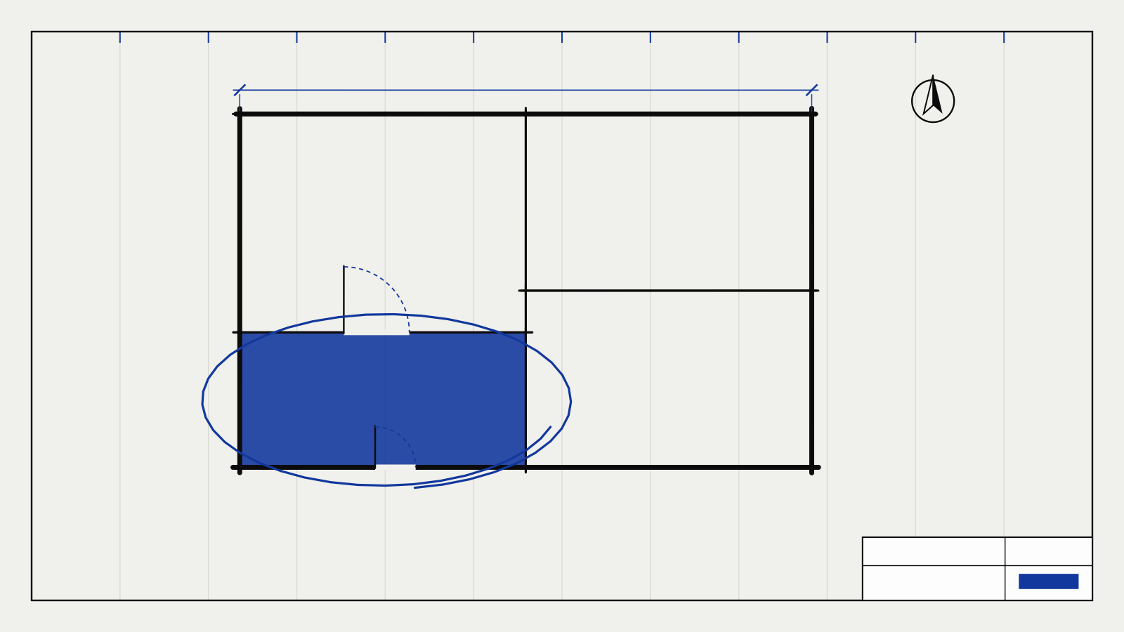
Clarity of pathway integrated with wide, accessible doors. Keeping the layout of the building clean and the circulation straightforward, eliminating obstacles allows for more free movement for all using the space without highlighting "accessible" needs. Clear access and wider doors promote a more open experience as well as ease of use for occupants. Gives the plan a strong, clear overall organizing principle.
Plan Open Training Floor Circulation
Dirk JamisonOwner · Lift Silverlake
I integrate accessibility and inclusive use by treating it as part of the original spatial plan, not something to solve after the main design is finished. When I opened my strength training gym, one practical move was keeping the training floor open, with generous pathways and equipment arranged around movement patterns rather than packing in as many stations as possible. That made it easier for people with limited mobility, older clients, and beginners to move through the space comfortably, while also giving coaches better sightlines and making the gym feel calmer and more intentional.
That experience taught me that good accessibility often improves the architecture for everyone. Clear circulation, fewer unnecessary obstacles, adjustable equipment, and enough room around training areas make a space easier to understand and use regardless of someone's physical ability or experience level. The best inclusive design decisions are the ones people barely notice because they simply make the space work better.
Accept Receipts Through Familiar Messaging
James RowellChief Technology Officer · Capture Expense
Accessibility gets built into the architecture when you treat the ways people reach the product as part of the system design, in the same category as the database schema. For an expense platform, that means asking who is submitting a receipt and under what conditions before drawing a single screen. Our users include field engineers on site, construction crews, and staff in education and local government, many of them on a phone with one hand, in poor signal, with gloves on, or with limited vision.
The design move that changed the most was accepting receipts through the messaging tools people already had open: WhatsApp, Slack, and Teams, with the extraction and matching happening on our side once the image arrives. It removed the login, the navigation, and the form for the single most common action in the product. Users with motor or visual impairments benefited first, then everyone who was tired, rushed, or offline. It also forced a cleaner separation between capture and processing in the codebase, which made the mobile app simpler to maintain.
Build Generous Step-Free Home Circulation
Michael PlanckAge-Friendly Housing & Accessibility Consultant · Planck Immobilien
I believe accessibility works best when it is considered part of the architecture from the beginning rather than added later as a separate feature.
One design move that can make a significant difference is creating generous, step-free circulation throughout the home. Instead of treating accessibility as a series of visible adaptations, we integrate wider doorways, flush thresholds and clear circulation routes into the overall design. When planned from the start, these elements simply look like good architecture rather than accessibility modifications.
This benefits far more people than just wheelchair users. Someone using a rollator, a person with reduced mobility, a parent pushing a stroller, or someone carrying large objects can all benefit from wider, unobstructed routes and step-free transitions.
It also changes how the space feels. Removing unnecessary thresholds and creating clear, generous movement paths can make a home feel more open, calm and connected. The result is an environment that is easier to use without drawing attention to the fact that it has been designed for accessibility.
My approach is to ask not only, "How can we make this accessible?" but "How can we make this space easier and more intuitive for everyone?" When accessibility is incorporated into the architectural concept from the beginning, it becomes almost invisible—and that is often the sign that it has been done well.